August 26, 2008
Median income rose as did poverty in 2007
2000s have been extremely weak for living standards of most households
See also this special supplement to today’s Income Picture, Overall health insurance coverage rises, but masks decline in private coverage.
Numbers released by the U.S. Census Bureau this morning show that the inflation-adjusted incomes of median households rose by 1.3% in 2007 from the previous year, from $49,568 in 2006 to $50,233 in 2007 (2007 dollars), while the overall poverty rate or increased slightly, from 12.3% to 12.5%. Given the weakening job market last year, the median income of working-age households (those headed by someone less than 65) rose insignificantly in 2007, and was $2,010 below its 2000 level.
While last year’s overall income gains are good news, the longer-range view is quite different. The Census figures show that the economic cycle that began in 2000 and ended late last year was one of the weakest on record for working families, despite strong overall economic growth during the same period (see Table 1 and Figure 1).

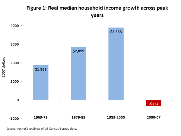
Looking at the full cycle across economic peak years—a more useful measure in evaluating economic performance—reveals that household income was no higher in 2007 than in 2000, the previous peak. Given rising joblessness and declining real wages, next year’s numbers will certainly be worse.
Comparisons between 2000 and 2007 reveal:
- Median income fell further for working-age households than for all households because job and wage growth was particularly weak in the 2000s relative to past cycles (see Figure 2).
- The poverty rate grew from 11.3% to 12.5%. During the seven-year cycle, the poverty rate declined significantly in only one year (2006). In contrast, poverty rates fell significantly in the 1990s.

- Family, as opposed to household, incomes were also unchanged over the cycle, for the first time since records were kept for this category starting in 1947. (The household income category, which includes single persons, was started in 1967.)
- Despite strong gains in earnings last year, men who worked full-time made essentially no gains from 2000-2007 because of large losses from 2003 to 2006. The 2007 median earnings of these workers “closely connected to the job market” were only 0.6% higher—$260 dollars—than their level in 2000.
- After declining from 2002 to 2006, women working full-time experienced strong earnings gains last year, up 5% in real terms. With last year’s gain, their 2007 annual earnings were 6.2% higher than in 2000.
- African American median household income rose 3.2% last year, but took a big hit overall in the 2000s, down 5.1% ($1,800). Figure 3 shows the percentage change in real incomes for various racial and ethnic groups.
- And yet workers were highly productive during this period. Output per hour, or productivity, rose 2.5% per year during the 2000 to 2007 cycle, compared to 2% in the 1990s, when family incomes fared much better.

Productivity Gains and Inequality
The economy of course expanded in the 2000s, but that growth clearly failed to reach most households, a dynamic that implicates growing income inequality.
For example, output per hour, or productivity, grew strongly in the 2000s, up 2.5% per year from 2000 to 2007, compared to 2.0% in the 1990s. Economists consider productivity growth the key determinant of rising living standards. Yet the fact that these disappointing income, poverty, and earnings trends occurred in the context of strong productivity growth is a reminder that in today’s economy, productivity growth creates only the potential for higher living standards. As long as most workers lack the bargaining power to claim their share of the growth they have helped to generate, that potential will not be realized.
Today’s report also provides some data that allows for inequality analysis. Figure 4 plots the percent change in real income by various percentiles of household income, from the 20th (20% of households have lower income, 80% have higher income) to the 95th percentile. The staircase pattern of the real changes indicates growth in income inequality.

When it comes to tracking inequality, however, these Census data have some inherent limitations. For reasons of confidentiality, for example, earnings values above one million dollars are recorded as $999,999 (i.e., they are “top-coded”). Also, these data leave out a major source of income for the wealthiest families: capital gains realized from selling assets. Other data sources that do not have these limitations reveal sharp increases and historically high levels of inequality over these years.
Income analysts Piketty and Saez [MS Excel] have constructed a widely cited income series back to 1913, using Internal Revenue Service data that include realized capital gains and include higher incomes. Their data show that after falling with the stock market bust of 2001, the average income of the top 1% grew about 50% in real terms from 2002 to -2006, from about $850,000 to $1.3 million (2007 dollars). Coming on top of the long-term trend in rising inequality since the late 1970s, this recent surge has resulted in the second highest level of income concentration on record going back to 1913, as the richest 1% of households held 23% of income in 2006. The only year of greater income concentration was 1928 (24%).
A Tale of Two Cycles
A deeper comparison of the past two economic cycles reveals that growth was much more broadly shared in the 1990s than in the 2000s, with the largest differences affecting minorities. African American households in particular did much better in the 1990s than in the 2000s.
An important dimension to this comparison is that productivity growth was actually faster in the 2000s. In this sense, there was the potential for faster growth across the income scale in the 2000s relative to the 1990s, a potential that was never realized.
Figure 5 looks at poverty rates from 1989 forward, and Figure 6 does the same for real median household income for all households and for African Americans. Poverty rose in the recession of the 1990s and for a few years during the weak recovery that followed. But then ensued a period of lasting, steep declines in poverty rates. Median income follows a similar pattern, with particularly sizable gains for African American households.


These patterns appeared to repeat themselves through the 2001 recession and jobless recovery. But instead of reversing course, the trends essentially stagnated through last year, which represented the last opportunity for improvements in this recovery. Had the incomes of middle-class households continued to rise at the rate that prevailed over the 1990s, their income would have been $2,600 higher in 2007 compared to 2000, instead of $300 lower.
Table 2 presents a more extended set of comparisons over the two cycles. The top panel shows percent changes in real median household income and the bottom panel tracks percentage point changes in poverty rates. For example, median household income of African American families grew strongly in the 1990s, up 22%, and poverty rates for blacks fell 8 percentage points. But in the 2000s, these trends reversed and African American poverty rose (up 2 percentage points) and real median income fell (down 5.1%).
These reversals are remarkable and provide a clear picture of the shift in fortunes over these years. Real middle-class incomes were up across the board in the 1990s, especially for minority households. This outcome is very much attributable to the full-employment job market that prevailed in the latter half of the 1990s, as tight job markets are particularly beneficial to lower-wage workers and groups that experience higher than average levels of joblessness (their incomes and poverty rates are more responsive to unemployment than higher income households). The nation’s payrolls grew by 22.7 million over the 1990s cycle compared to 5.6 million jobs over the 2000s. With the lackluster job market of the 2000s, the losses of the 2001 recession simply evolved into stagnation over the weak expansion.
Table 2 also compares poverty rate changes for a few particularly economically vulnerable groups, single-mother families and children (with a separate line for African American children). These groups all saw sharp declines in their poverty rates in the 1990s, which have all been partially reversed in the 2000s. These trend reversals do not reflect policy changes, such as welfare reform, which took place in the earlier period. They instead reflect diminished economic opportunities and far less equitable distribution of the growth that occurred over the two periods.
The last line in Table 2 provides an important contrast—productivity growth. Contrary to the negative shift regarding incomes and poverty, productivity growth actually accelerated in the 2000s, growing half-a-percent per year faster than in the 1990s. Thus, thanks to the more efficient performance of the American workforce, the economic pie was growing faster in the 2000s, yet most household ended up with thinner slices.

See also this special supplement to today’s Income Picture, Overall health insurance coverage rises, but masks decline in private coverage.
To view archived editions of INCOME PICTURE, click here.
The Economic Policy Institute INCOME PICTURE is published upon the annual release of family income data from the Census Bureau.
EPI offers same-day analysis of income, price, employment, and other economic data released by U.S. government agencies. For more information, contact EPI at 202-775-8810.
