What to watch on jobs day: Job losses in April may set U.S. employment levels back 20 years
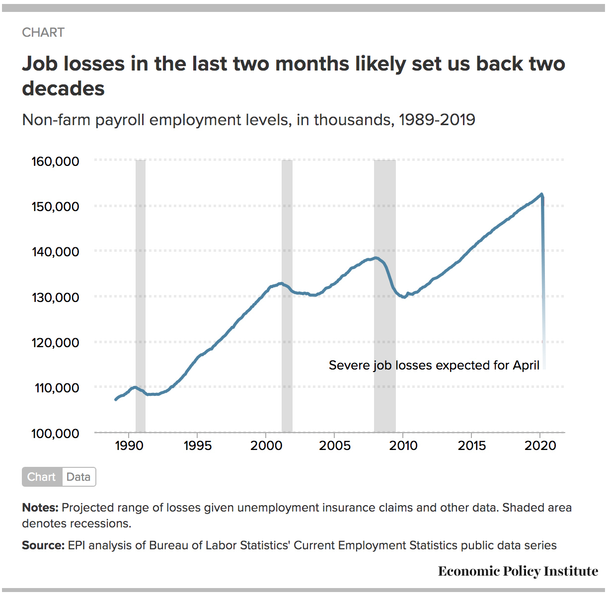
- Job losses in the last two months likely set us back two decades.
- Aggregate weekly work hours will continue to fall precipitously.
- Don’t be misled by stronger-than-expected nominal wage growth.
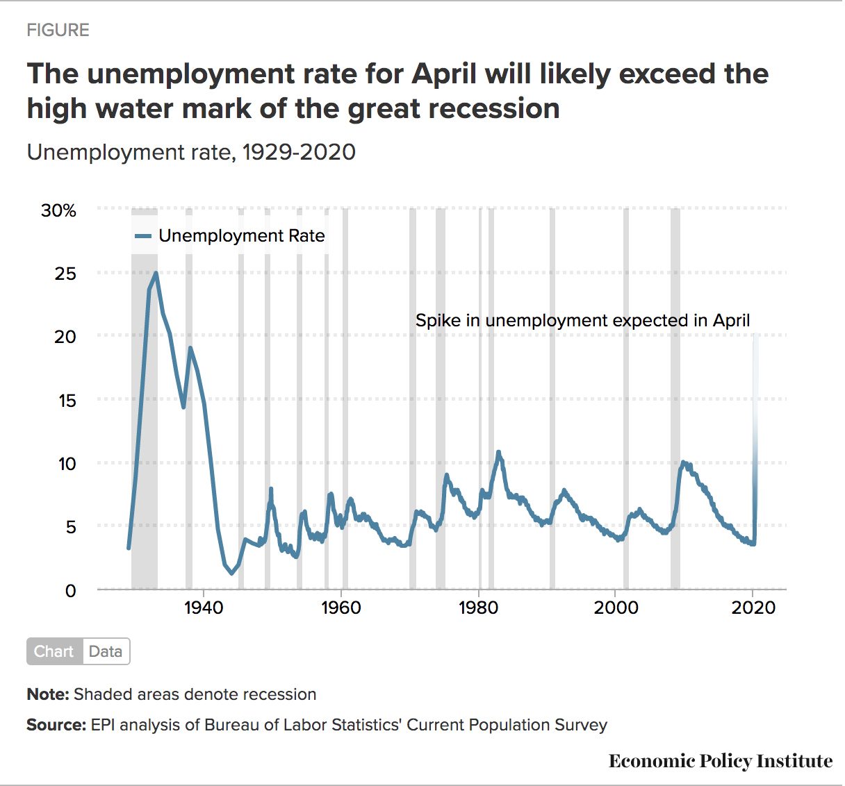
- The unemployment rate will exceed the high-water mark in the Great Recession. Black unemployment could hit 20% in April.
- The employment-to-population ratio, or the share of the population with a job, will drop sharply.
On Friday, the Bureau of Labor Statistics (BLS) will release the latest monthly employment situation report for April and, based on the weekly numbers of workers who’ve applied for unemployment insurance, the labor market losses will be enormous. Last month’s report was just the tip of the iceberg of the labor market devastation experienced across the country over the last several weeks. By the reference week for the April report, an astounding 24.4 million workers had applied for claims. At the same time, millions more have been unsuccessful at filing claims either because they couldn’t get through or found the process too difficult.
Workers have been laid off, furloughed, or have needed to leave their jobs for COVID-19-related reasons. Because of the uncertainty in how many workers have lost their jobs and how they will be counted in the latest statistics—and uncertainty about how many workers have not been hired because job openings have dried up in this crisis—there are a wide range of projections for what we will see on Friday.
Here, I’m going to unpack a few of the key statistics and speculate on just how deep and wide-reaching this recession already is for workers across the economy.
Payroll job losses may set us back to employment levels last seen in the late 1990s
In March, nonfarm payroll employment contracted by a whopping 701,000 jobs, including a loss of 713,000 private-sector jobs. It’s worthwhile noting that the losses among production and nonsupervisory workers were far greater. Production and nonsupervisory workers—who represent roughly the bottom 82% of all workers, when lined up by earnings—lost 898,000 jobs in March.
It appears that these job losses were not only congregated in lower-wage sectors, such as leisure and hospitality, but also in the lower-wage front-line parts of the economy in general. Along with the topline payroll numbers, the production/nonsupervisory series will certainly be one of the indicators to watch on Friday.
Since March, the coronavirus pandemic has sent tsunamis throughout the economy, causing devastating losses never before seen in such a short period of time. While initial losses were concentrated in sectors such as leisure and hospitality, this insightful analysis of the unemployment insurance claims data illustrate that the losses are large and have spread throughout most of the labor market over the last several weeks. In addition, initial losses appeared to be slightly disproportionately found among women workers, but job losses as the recession has continued may be more evenly distributed by gender; this split will be more evident when the data are released on Friday.
To construct their estimate of total nonfarm payroll, BLS relies on surveys of establishments and their predictions of the creation and elimination of new ones, otherwise known as their birth and death model. It is likely that the survey data will be thinner than usual as establishments themselves contend with difficulty in operations at this time; the BLS reported a lower collection rate for March and it appears likely that this has happened for April as well.
Furthermore, they have indicated modification to their net birth and death model with this month’s jobs report. Historically, there have been significant revisions to nonfarm payroll employment at turning points in the business cycle. For perspective, in 2009, during the Great Recession, annual payroll employment was revised down by about 900,000 jobs. I’m hopeful that the BLS model revisions will better capture those losses in the data that are released on Friday.
The leading indicator of filed unemployment insurance claims provides one picture of how large the losses to nonfarm payroll employment might be, but there are still several unknowns.
On the one hand, the claims data may underreport actual losses because for every 100 filers, there may be up to another 50 who lost their job but couldn’t get through the application process or found it too difficult and gave up trying to apply. Some predict that job losses could exceed 40 million given missing claims and undocumented workers (who do not qualify for UI).
There may also be sizeable losses in employment due to the workers that weren’t hired as opposed to just those who were let go.
On the other hand, if the response rate is low, the survey will presumably be more likely to have missed struggling firms and as a result, the initial report on payroll employment losses may come in lower than expected, understating the true extent of losses. Even if a non-response rate is lower among those establishments having capacity issues during the response period, these numbers will wind up getting revised as their responses are returned in the next report. It’s also conceivable that some workers may have been called back to work after initially filing for unemployment.
In their analysis, the ADP Research Institute put private-sector job losses at around 20 million for April.
The figure below illustrates both the uncertainty about the extent of job losses in April while highlighting the guaranteed enormous magnitude of job losses we will see. It is likely that the job losses we experienced have set us back about two decades of employment growth. At the low end, the jobs losses in April will most certainly have cancelled out all of the gains in the recovery from the great recession. At the high end, we will have returned to a level of employment last experienced in the mid-1990s, canceling out all of the gains in employment over the last 25 years.
Aggregate hours worked will continue to fall precipitously
Nonfarm payroll employment is measured by the total number of payroll jobs; the change in payroll employment is the number of jobs that were added/subtracted in the last month. That is, a payroll job either exists or it doesn’t. Economists call that the “extensive margin”. But, the drop in labor demand can also be absorbed through the intensive margin, basically how many hours are worked by those who continue to be employed. Aggregate weekly work hours enables us to examine both.
Aggregate weekly hours are the product of estimates of average weekly hours and employment. BLS creates an index of aggregate weekly hours by dividing the current month’s estimates of aggregate hours by 2007 annual average aggregate hours. Therefore, when the index is above 100 it means that average aggregate hours are greater than in 2007 and when the index is below 100 it means that average aggregate hours are lower than in 2007. In March, the index of aggregate weekly hours fell 1.1%, reflecting losses in both weekly hours and overall payroll employment. Again, these losses were particularly sharp in leisure and hospitality.
Aggregate weekly hours are a key indicator to watch in the jobs data on Friday.
I’m guessing aggregate hours will look like they are falling off a cliff in April because they will capture both the job losses as well as the drop in hours worked.
Look away from growth in nominal wages
In the couple of years before the pandemic, nominal wage growth was the most important indicator to watch on jobs day. With the unemployment rate at historic lows, it seemed that we were going to start seeing stronger wage growth in the economy as the labor market recovery finally reached workers’ paychecks.
Now, I must advise readers and policymakers to look away from what may be a shiny and appealing number on Friday. At turning points in the economy, compositional effects tend to swamp any changes in wages within sectors or occupations or even workers grouped by educational attainment. While workers across the economy lost their jobs in April, many of the job losses are likely to be concentrated in lower wage jobs. Therefore, stronger wage growth in April would reflect the dropping of lower wage jobs from the total, which results in higher average wages for the remaining jobs, and what appears to be faster overall growth, but not driven by people getting meaningful raises.
This phenomenon occurs at turning points generally, as can be seen by stronger nominal wage growth in 2008 and early 2009 before it fell off sharply by mid-2009.
The unemployment rate will exceed the high water mark in the great recession
The uncertainty around payroll employment calculated from the establishment survey pales in comparison to the uncertainty around the unemployment rate calculated from the household survey. If all the workers who filed for unemployment insurance up to and including the reference week (April 12-18 in the claims data) were counted in the measured unemployment numbers, the unemployment rate could hit 18% in the latest jobs day release.
Of course, this fails to count the workers who were unable to file or lost their jobs and were ineligible for unemployment insurance. The CARES Act provisions that greatly expanded eligibility for unemployment insurance were only operational in most states in the last couple of weeks. Taken together, this could suggest an unemployment rate in excess of 20%, levels last seen in the great depression.
At the same time, there are substantial forces moving in the opposite direction, which would indicate that the unemployment rate may be reported at levels consistent with the high-water mark of the great recession, that is, no higher than about 10%.
There are pertinent reasons to conclude that the unemployment rate will be lower than the jobless claims would suggest.
Most importantly, to be counted among the unemployed, a worker must be actively looking for work in the prior four weeks (with the only exception being if a worker is on a temporary layoff and expects to be called back). I’ve previously made the case that the unemployment rate shouldn’t be the trigger for policy decisions because a large share of workers who have lost their jobs will very likely not be counted in the official unemployment rate because they won’t be actively looking for work. Given the nature of the pandemic, where we are all being told to stay away from work and all non-essential public activity, many laid-off workers will make the rational decision not to search for work until they get the all-clear from public health authorities. Think of the restaurant worker who just got laid off. They might not report looking for work because that sector is largely shut down. What would be the point in actively looking for a job when it’s clear that there are none out there? Those job losses will show up in a drop in the labor force or a drop in the share of the population with a job, discussed below, but will not show up as a spike in the unemployment rate.
There are other ways for workers who were not working during the reference week to show up in the data; there’s a nice summary here.
These workers may show up as without a job, but others can get counted as employed if they have a job but were not at work for a variety of reasons. If they have a job but were not at work because they were ill, they’d be counted as employed whether or not they were being paid while they were out. But, if workers were temporarily laid off and expecting recall, they should be classified as unemployed on temporary layoff. BLS discussed these categorizations in great depth here and their analysis suggest that misclassification of workers into employed and not at work as opposed to temporarily unemployed may have led to a March unemployment rate that was just under 1 percentage point lower than it “should” have been. A lower response rate may also affect the numbers. In March, the response rate was about 10 percentage points lower than in preceding months. On the whole, this adds to the uncertainty around the projections as well as the data itself. Either way, it’s clear that the economic data release on Friday may be weird.
The figure below provides a historical benchmark for the unemployment rate from its height in the great depression at 24.9% in 1933 down to its low point near the end of the Second World War. The graph shows that the unemployment rate hit 10% at the height of the great recession of 2008-2009 and got down to 3.5% for several months before the pandemic struck.
While highly uncertain for all the reasons mentioned, the spike in unemployment in April will likely reach as high as it did in the depths of the great recession. And, may go far higher in ensuing months.
What’s also vital here is the differences in the experience of the labor market across different race and ethnic groups. For instance, if the historical relationship between overall and black unemployment holds, then the black unemployment rate may exceed 20% in April.
The employment-to-population ratio will drop sharply
If we measure the strength of the labor market as the share of the population with a job, we do not have to be concerned with most of the measurement issues associated with the unemployment rate, specifically whether would-be workers are actively looking for employment or not and therefore counted amongst the ranks of the unemployed.
Therefore, the employment-to-population ratio is a key indicator to watch in April and coming months. In fact, I’d focus on the share of the population, ages 25-54, with a job, otherwise known as the prime age employment-to-population ratio. The appeal of the age restriction is that it removes any possible confounding factors due to retiring baby boomers at the top end or longer years of schooling at the bottom end.
In the most recent recovery, the prime age employment-to-population ratio (EPOP) finally exceeded its level reached prior to the great recession and was slowly, but steadily heading towards its series high in 2000. In March, we already saw a small but sharp decline in the prime age EPOP, erasing any gains made in the last year. It is likely that this will fall significantly in April falling well below the low points of the last two troughs.
Friday’s jobs report will be full of useful insights into the state of the labor market.
I’d be remiss if I didn’t also mention the underemployment rate and the labor force participation rate, which will likely indicate considerable weakness compared to the pre-pandemic period. On the whole, I’d lean a bit more heavily on the findings of the establishment survey—payroll employment and aggregate work hours—but, the household survey will provide useful texture on the labor market for various demographic groups.
Enjoyed this post?
Sign up for EPI's newsletter so you never miss our research and insights on ways to make the economy work better for everyone.