On Brooks’ muddled defense of the top 1%
Yesterday, we critiqued an essay by James Q. Wilson on income inequality. Today, it’s New York Times columnist David Brooks’ turn. Brooks presents another defense of the top 1 percent, one that is just plain wrong about income trends and the income divide in America. And if he got his facts from Charles Murray, then Murray is wrong too. I just can’t let this one slide:
“Democrats claim America is threatened by the financial elite, who hog society’s resources. But that’s a distraction. The real social gap is between the top 20 percent and the lower 30 percent. The liberal members of the upper tribe latch onto this top 1 percent narrative because it excuses them from the central role they themselves are playing in driving inequality and unfairness.”
Brooks would have us believe that there’s commonality among the top fifth and the only losers are those in the bottom 30 percent. So, let’s examine how the various slices of the population have fared to see whether: the 1 percent sticks out, whether trends for the rest of the top 20 percent are more closely aligned to the top 1 percent or to the bottom 80 percent, and whether the bottom 30 percent fares differently from the rest, especially the middle. The simple answer is that the top 1 percent enjoyed far superior wage and income growth than every other segment of the population and that the lowest 30 percent does not stick out as faring worse than the broad middle class. The mantra of the top 1 percent and the other 99 percent corresponds to the actual facts, as we have pointed out before. So has the Congressional Budget Office. In this post, I will present data from the end of the 1980s recovery, 1989, until the end of the last recovery in 2007.
Here’s a look at inflation-adjusted hourly wage trends for each decile from 1989 to 2007, using computations of the Current Population Survey, which unfortunately does not allow us to examine the 1 percent—I do so below with other data. For the uninitiated, the 20th percentile is those who earn more than 20 percent of the workforce but less than the other 80 percent.
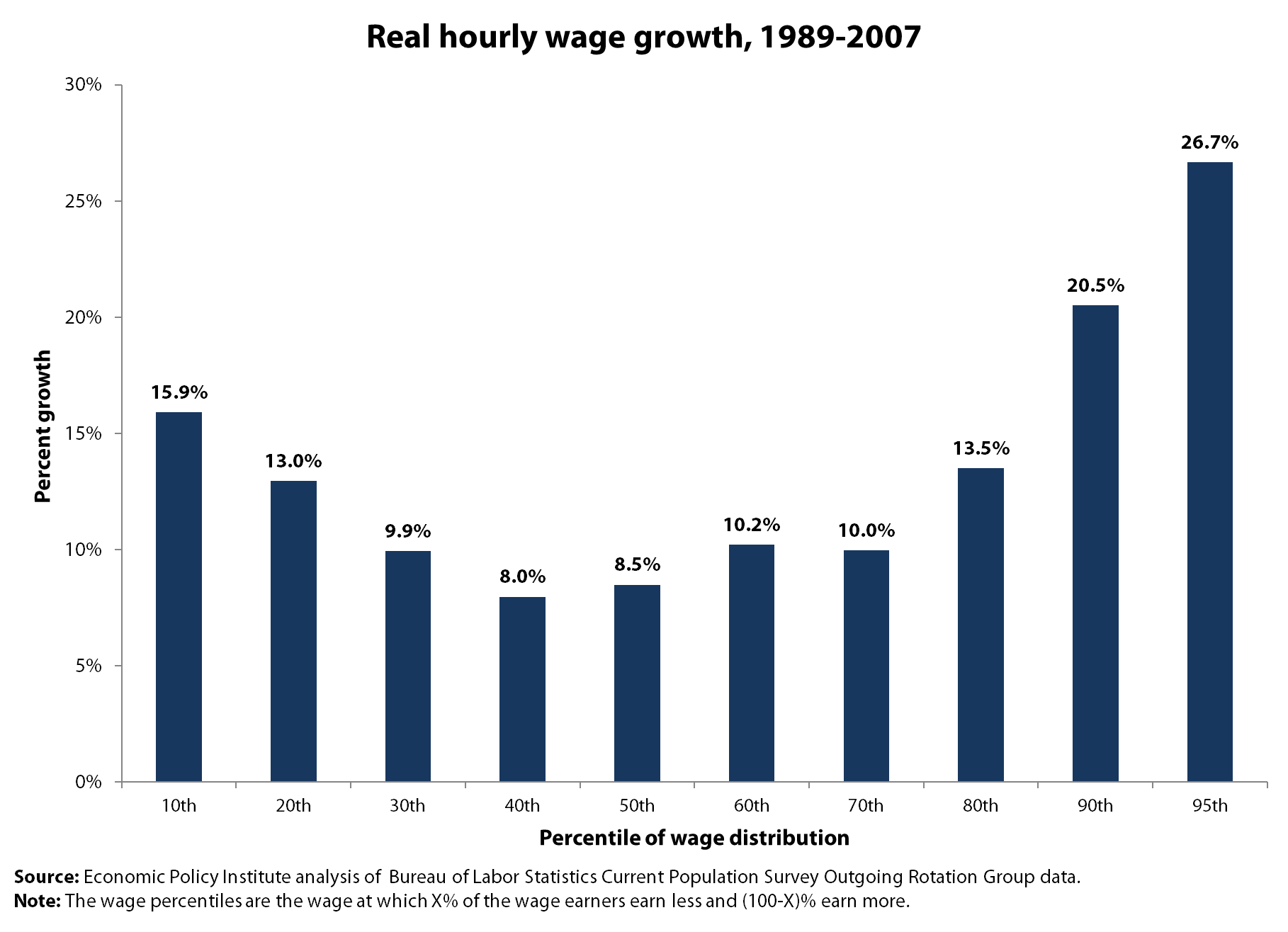
In terms of wage growth, the bottom 20 percent saw faster growth than the middle, the entire middle from the 30th to the 70th percentiles saw comparable wage growth of about 10 percent, and the best wage growth starts at the 90th percentile and is even better at the 95th percentile (growing 26.7 percent). So, if there’s a divide here, it starts at the upper 10 percent and there’s a great commonality among the bottom 90 percent. By the way, almost all of the wage growth for the bottom 90 percent occurred in the late 1990s boom from 1995 to 2000. Last, there was a period when the fortunes of the bottom 20 percent (not 30 percent) fared far worse than the broad middle, but that was in the 1980s.
But what about the top 1 percent? For that we need to look at Social Security wage data which allows us great detail at the top but not much within the bottom 90 percent. These are inflation-adjusted annual wage trends from 1989 to 2007:
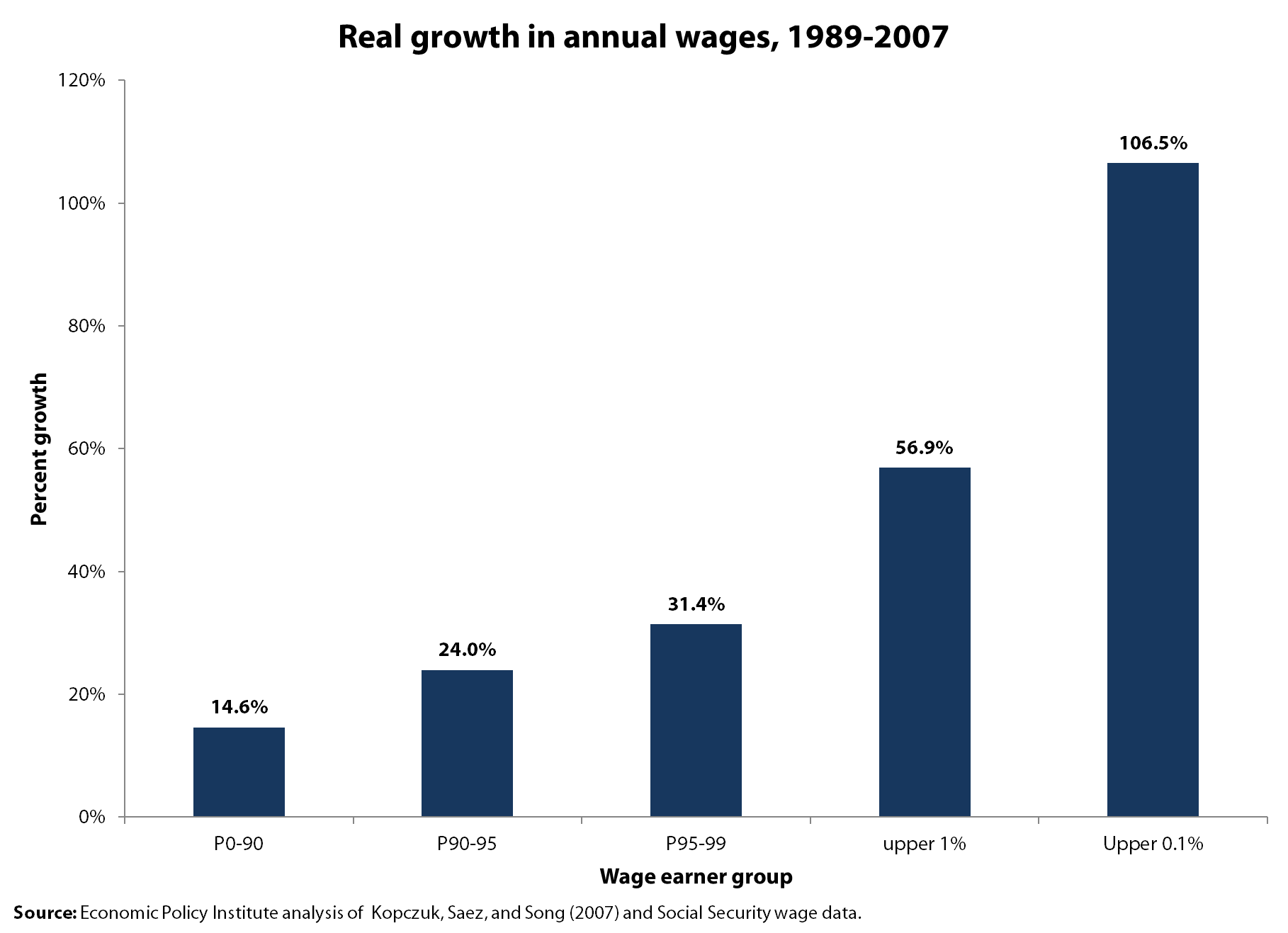
Looks to me like the top 1 percent fared remarkably better than everybody else and that the top 0.1 percent, with 106.5 percent wage growth really distinguished themselves. These wage trends put the top 1 percent with wages 20 times that of those in the bottom 90 percent, up from ratios of 15-to-1 in 1989 and 9.4-to-1 in 1979.
Perhaps Brooks was referring to household incomes and not to individual workers’ wages, so let’s turn to CBO data on income growth (pre-tax) between 1989 and 2007. (CBO provides income levels for each fifth and the top 10 percent, top 5 percent and top 1 percent, and I have deduced the trends for other categories to flesh out the picture).
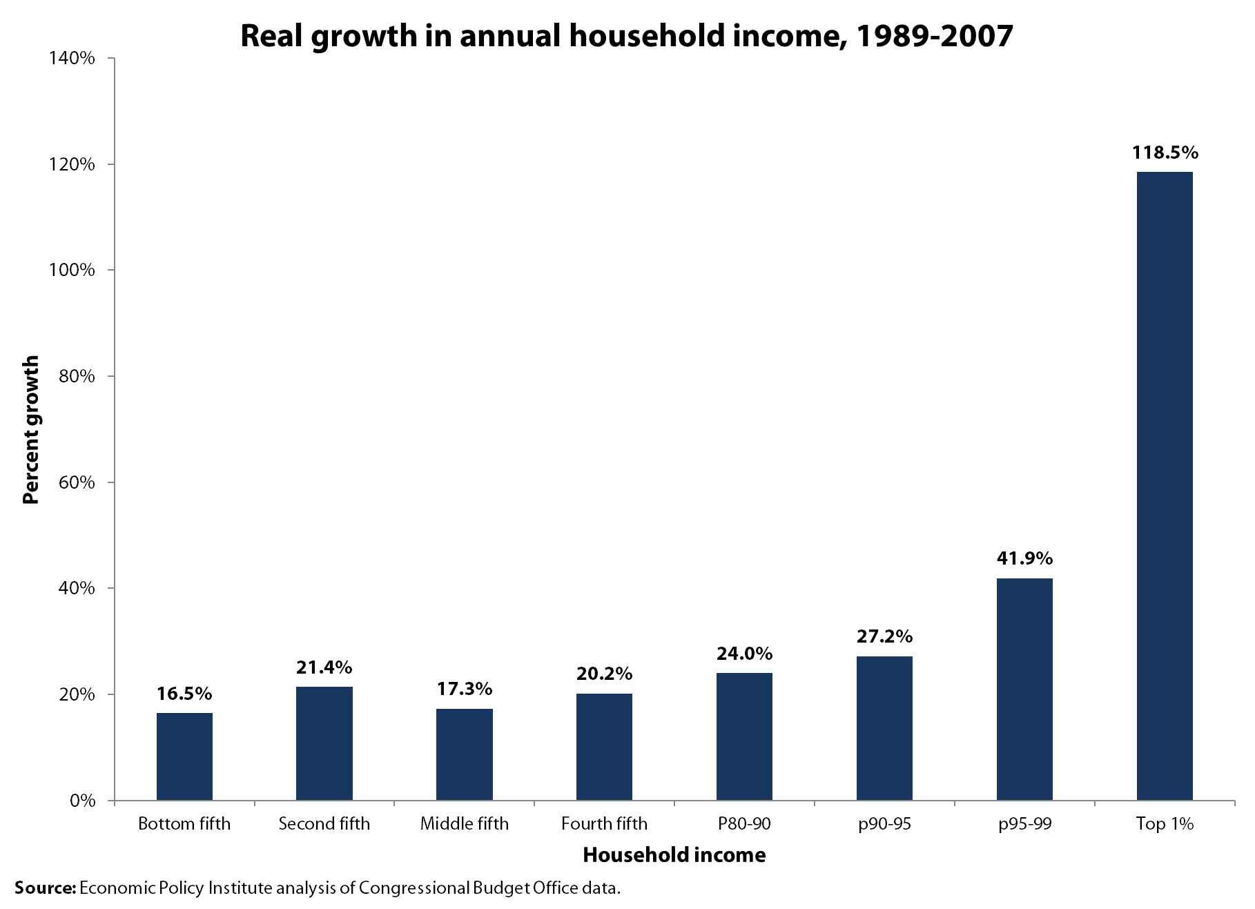
The income trends for the bottom 95 percent vary but look pretty similar across the bottom 80 percent (from 16.5 in the lowest fifth to 20.2 percent in the fourth fifth, with the middle fifth faring essentially the same as the bottom). If anything sticks out, it’s the 118.5 percent income growth of the top 1 percent, whose incomes grew four times as fast as those in the bottom three-fourths of the group Brooks wants to label privileged—the top fifth. The income divide that Brooks sees does not appear in our world, at least from what we can learn from wage or income data.
Enjoyed this post?
Sign up for EPI's newsletter so you never miss our research and insights on ways to make the economy work better for everyone.