Average wage growth continues to flatline in 2018, while low-wage workers and those with relatively lower levels of educational attainment see stronger gains
Real (inflation-adjusted) average hourly wages from the Current Employment Statistics (CES) survey did not grow at all between June 2017 and June 2018. This is not only troubling, but mildly surprising given the historically low unemployment rate of 4.0 percent. Some of this real wage stagnation can be explained by an uptick in energy prices, but even the underlying pace of nominal wage growth has yet to pick up in the way it historically has as labor markets tightened. It’s likely that the unemployment rate is overstating the strength of the economy given still soft labor force participation and the prime-age employment-to-population ratio. Even so, a steadily improving economy should eventually translate into stronger wage growth. And, if there were any thoughts that those tax cuts were going to lead to faster wage growth, which was doubtful in the first place, zero wage growth certainly isn’t a compelling case.
But the CES is only one measure of wage growth. Its large sample size and benchmarking make it one of the most reliable measures, but it only provides information on average wages for very large groups of workers (all workers or the 82 percent who are non-supervisory). The Current Population Survey-Outgoing Rotation Group (CPS-ORG) allows us to see what’s happening at different parts of the wage distribution and for workers with varying levels of educational attainment. Because of the volatility in the CPS-ORG, we’ve constructed annual averages for the year ending in June of each year, combining first half data in the stated year with second half data in the prior year. All wages are in first half 2018 dollars. Using this metric, real average hourly wages in the CPS-ORG grew 1.2 percent between 2017 and 2018. Table 1 below shows real wages by wage percentile for 2000, 2007, 2017, and 2018, with annualized changes between each set of years shown at the bottom of the table.
Hourly wages by wage percentile, 2000–2018 (FH2018 dollars)
| Wage by percentile | ||||||||||
|---|---|---|---|---|---|---|---|---|---|---|
| Year | 10th | 20th | 30th | 40th | 50th | 60th | 70th | 80th | 90th | 95th |
| 2000 | $9.09 | $11.20 | $13.11 | $15.10 | $17.89 | $20.97 | $24.80 | $30.05 | $39.23 | $50.07 |
| 2007 | $9.30 | $11.36 | $13.27 | $15.61 | $18.20 | $21.54 | $25.41 | $31.12 | $41.87 | $53.82 |
| 2017 | $9.85 | $11.44 | $13.47 | $15.60 | $18.63 | $21.96 | $26.45 | $33.41 | $46.19 | $60.95 |
| 2018 | $10.06 | $11.90 | $13.89 | $15.95 | $18.72 | $22.00 | $26.56 | $33.62 | $46.49 | $62.26 |
| Annualized percent change | ||||||||||
| 2000–2007 | 0.3% | 0.2% | 0.2% | 0.5% | 0.2% | 0.4% | 0.3% | 0.5% | 0.9% | 1.0% |
| 2007–2018 | 0.7% | 0.4% | 0.4% | 0.2% | 0.3% | 0.2% | 0.4% | 0.7% | 1.0% | 1.3% |
| 2017–2018 | 2.2% | 4.0% | 3.1% | 2.3% | 0.5% | 0.2% | 0.4% | 0.6% | 0.7% | 2.2% |
| 2000–2018 | 0.6% | 0.3% | 0.3% | 0.3% | 0.3% | 0.3% | 0.4% | 0.6% | 0.9% | 1.2% |
Note: The xth-percentile wage is the wage at which x% of wage earners earn less and (100-x)% earn more.
Sample based on all workers ages 18–64. Each year represents annual data, calculated using the first-half data in the listed year combined with the second-half data for the prior year.
Source: EPI analysis of Current Population Survey microdata
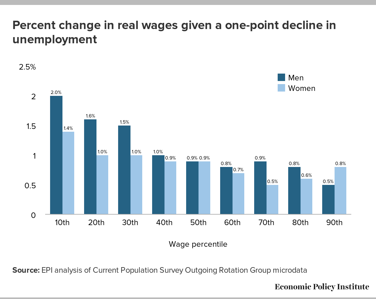
Real hourly wage growth over the last year is relatively polarized, with the strongest growth among the bottom 40 percent of workers along with those at the 95th percentile. More broad based growth, with particularly strength at the bottom of the wage distribution, is expected as we continue to move toward full employment. When the unemployment rate falls, even as more workers are drawn into the labor market, available workers of all types become scarcer and employers have to increase wages to attract and retain the workers they want. Lower unemployment has, in the past, benefited low-wage workers more than middle-wage workers and middle-wage more than higher-wage workers. In addition, in the last three to four decades of growing inequality, high-wage workers have had more leverage to bid up their wages faster than others. That trend has continued through the 2000s.
However, the CPS trends in wages for most workers over the last year, while welcome, still have left many of these workers just beginning to make up for lost ground. Figure A below shows cumulative real wage changes by decile since 2000 and 2007. Rising wage inequality continues to be a defining feature of the American economy. Because of the recent uptick in wages for the 20th through 40th percentiles over the last year on top of steady increases over the last few years at the 10th percentile, wage growth is in the rough shape of a checkmark with stronger growth at the bottom attributed to several consecutive years of state-level minimum wage increases and a growing economy, while the fastest growth at and near the top is a continuation of the trends in growing inequality since the 1970s.
Real wage changes by decile and the 95th percentile, 2000–2018 and 2007–2018
| Percent change 2000–2018 | Percent change 2007–2018 | |
|---|---|---|
| 10th | 10.7% | 8.2% |
| 20th | 6.3% | 4.8% |
| 30th | 6.0% | 4.7% |
| 40th | 5.6% | 2.1% |
| 50th | 4.6% | 2.9% |
| 60th | 4.9% | 2.1% |
| 70th | 7.1% | 4.5% |
| 80th | 11.9% | 8.0% |
| 90th | 18.5% | 11.0% |
| 95th | 24.3% | 15.7% |
Note: The xth-percentile wage is the wage at which x% of wage earners earn less and (100-x)% earn more.
Sample based on all workers ages 18–64. Each year represents annual data, calculated using the first-half data in the listed year combined with the second-half data for the prior year.
Source: EPI analysis of Current Population Survey microdata
The CPS-ORG also allows us to examine wages for workers with different levels of educational attainment. Table 2 shows real average hourly wages in FH2018 dollars for the five main educational groupings and annualized changes over the last year and since 2000 and 2007. It is particularly striking that the wages for workers with less than a high school degree or just a high school degree rose faster over the last year than any other group at 3.0 percent and 1.0 percent, respectively. Furthermore, wages for those with a college degree were essentially unchanged, rising 0.1 percent over the year. Cumulatively, over the last two years, wage growth for high school educated workers was faster than for college educated workers (2.6 percent versus 0.9 percent). Wage growth for those with an advanced degree was faster than those with just a college degree, but still slower than high school degree wages over the last year (0.6 percent) and the last two years (2.4 percent). The faster wage growth for those workers with just a high school degree pushes back directly against any evidence of education based skill shortages. If there was a shortage of skills associated with college educated workers in the economy today, then employers would raise wages to attract and retain those workers as well as to poach them from competitors. The latest wage data tell a very clear story against that narrative. While not definitive, this is a sign that there is no shortage of skills associated with credentialed workers in the economy today.
Average hourly wages by education, 2007–2018 (FH2018 dollars)
| Average wage by level of education | |||||
|---|---|---|---|---|---|
| Less than high school | High school | Some college | College | Advanced degree | |
| 2000 | $13.24 | $17.82 | $20.07 | $30.76 | $39.41 |
| 2007 | $13.62 | $18.16 | $20.35 | $31.64 | $40.18 |
| 2017 | $13.89 | $18.08 | $19.82 | $33.12 | $42.64 |
| 2018 | $14.31 | $18.26 | $19.98 | $33.14 | $42.88 |
| Annualized percent change | |||||
| 2000–2007 | 0.4% | 0.3% | 0.2% | 0.4% | 0.3% |
| 2007–2018 | 0.4% | 0.1% | -0.2% | 0.4% | 0.6% |
| 2017–2018 | 3.0% | 1.0% | 0.8% | 0.1% | 0.6% |
| 2000–2018 | 0.4% | 0.1% | 0.0% | 0.4% | 0.5% |
Note: Sample based on all workers ages 18–64. Each year represents annual data, calculated using the first-half data in the listed year combined with the second-half data for the prior year.
Source: EPI analysis of Current Population Survey Outgoing Rotation Group microdata
The figure below shows the cumulative growth in wages by educational attainment since 2007. It’s clear that since the last business cycle peak, right before the Great Recession began, college and advanced-degree workers have seen stronger wage growth than those with less education, except for those with less than high school, which surged ahead in the last year. In the last couple of years, it’s also clear from the figure that advanced degree workers and college degree workers saw slower wage growth than those with high school or less (their cumulative wage growth lines flattened out some while high school and less saw steeper increases). It’s also important to point out that even the faster longer term growth for those with an advanced degree is dwarfed by wage growth at and near the top of the wage distribution. Those with an advanced degree saw average wage growth of 6.7 percent since 2007, compared with 11.0 percent and 15.7 percent for the 90th and 95th percentile worker. So, those with more credentials tend to have stronger wage growth, but not so in the last couple of years and not nearly fast enough to fully explain high end wage growth. At the same time, workers with some college still have average wages lower than in 2007 and lower than in 2000 (as shown in Table 2). As the economy continues on the road to full employment, workers across the board should see better wage growth.
Change in real average hourly wages by education, 2007–2018
| Year | Less than high school | High school | Some college | College | Advanced degree |
|---|---|---|---|---|---|
| 2007 | 0.0% | 0.0% | 0.0% | 0.0% | 0.0% |
| 2008 | -0.7% | -1.0% | -0.7% | 0.3% | 0.7% |
| 2009 | 1.1% | 0.2% | -0.7% | 1.3% | 3.1% |
| 2010 | -0.7% | 0.1% | -0.5% | 0.6% | 4.5% |
| 2011 | -3.3% | -1.7% | -3.0% | -0.2% | 1.6% |
| 2012 | -4.1% | -3.1% | -4.9% | -1.6% | 2.2% |
| 2013 | -4.5% | -3.8% | -5.6% | -0.2% | 3.1% |
| 2014 | -5.4% | -4.8% | -6.3% | -1.0% | 1.3% |
| 2015 | -2.7% | -3.0% | -4.8% | 0.4% | 1.5% |
| 2016 | -0.1% | -2.0% | -2.6% | 3.8% | 4.2% |
| 2017 | 1.9% | -0.4% | -2.6% | 4.7% | 6.1% |
| 2018 | 5.1% | 0.6% | -1.9% | 4.7% | 6.7% |
Note: Sample based on all workers ages 18–64. Each year represents annual data, calculated using the first-half data in the listed year combined with the second-half data for the prior year.
Source: EPI analysis of Current Population Survey Outgoing Rotation Group microdata
Enjoyed this post?
Sign up for EPI's newsletter so you never miss our research and insights on ways to make the economy work better for everyone.